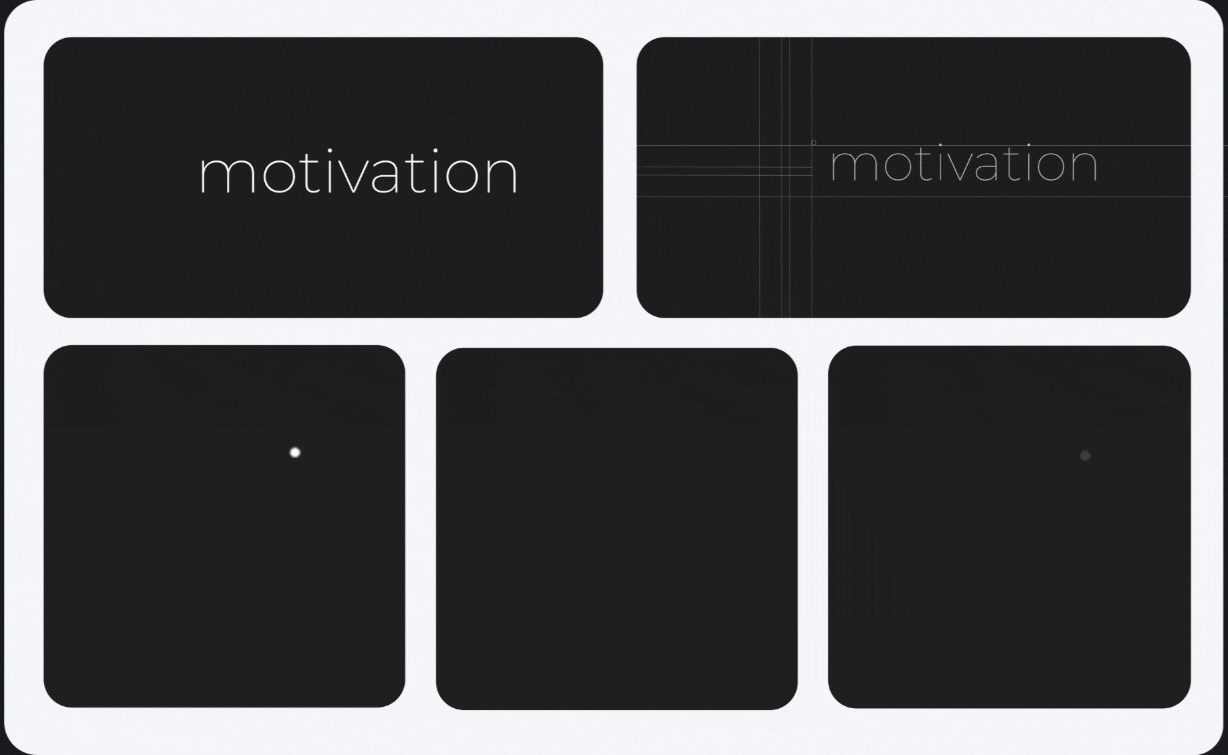
When darkness isn't just a phase
We didn't wake up one day and decide to slap a dark theme on everything. This was calculated. Intentional. Maybe even a little stubborn.
Here's the thing: when you're building an identity for a creative studio that's also highly technical and actually knows what it's doing, you don't need to shout. You don't need to chase whatever's trending this week. You just need to be really deliberate about your choices.
So we built everything around three things: clarity, focus, and confidence. The kind of studio that walks in, does exceptional work, and walks out. No fanfare. Just precision.
Why we chose the dark side

The philosophy
This isn't about being moody or mysterious for the sake of it. The dark theme reflects a commitment to intentional design that speaks through precision rather than volume. It's confident enough to exist in the shadows and still command attention.
Design that doesn't need to be the loudest voice in the room to be heard.
Photography: Black & white only
We made a rule early on: all photography is black and white. No exceptions.
It sounds strict, but here's why it works. When you strip color from images, the focus shifts. People and work become the stars, while our brand colors do their job in the UI and accents. It keeps everything consistent and makes every color choice feel purposeful instead of random.
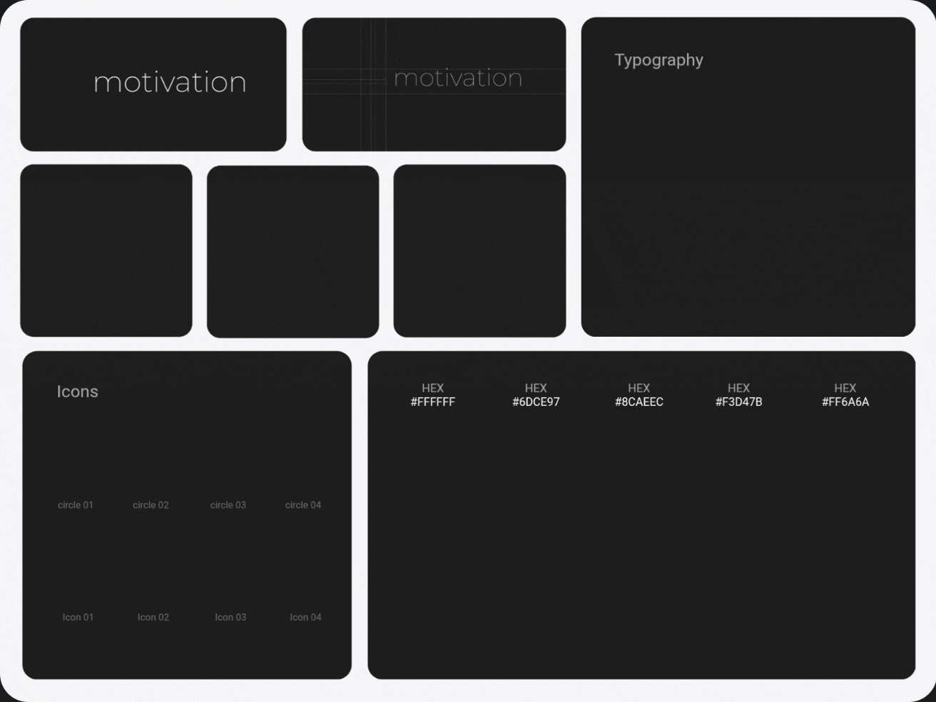
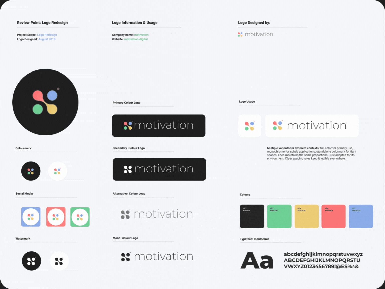
Color palette
Our palette isn't trying to do everything. Each color has a job, and nothing's there just to look pretty.
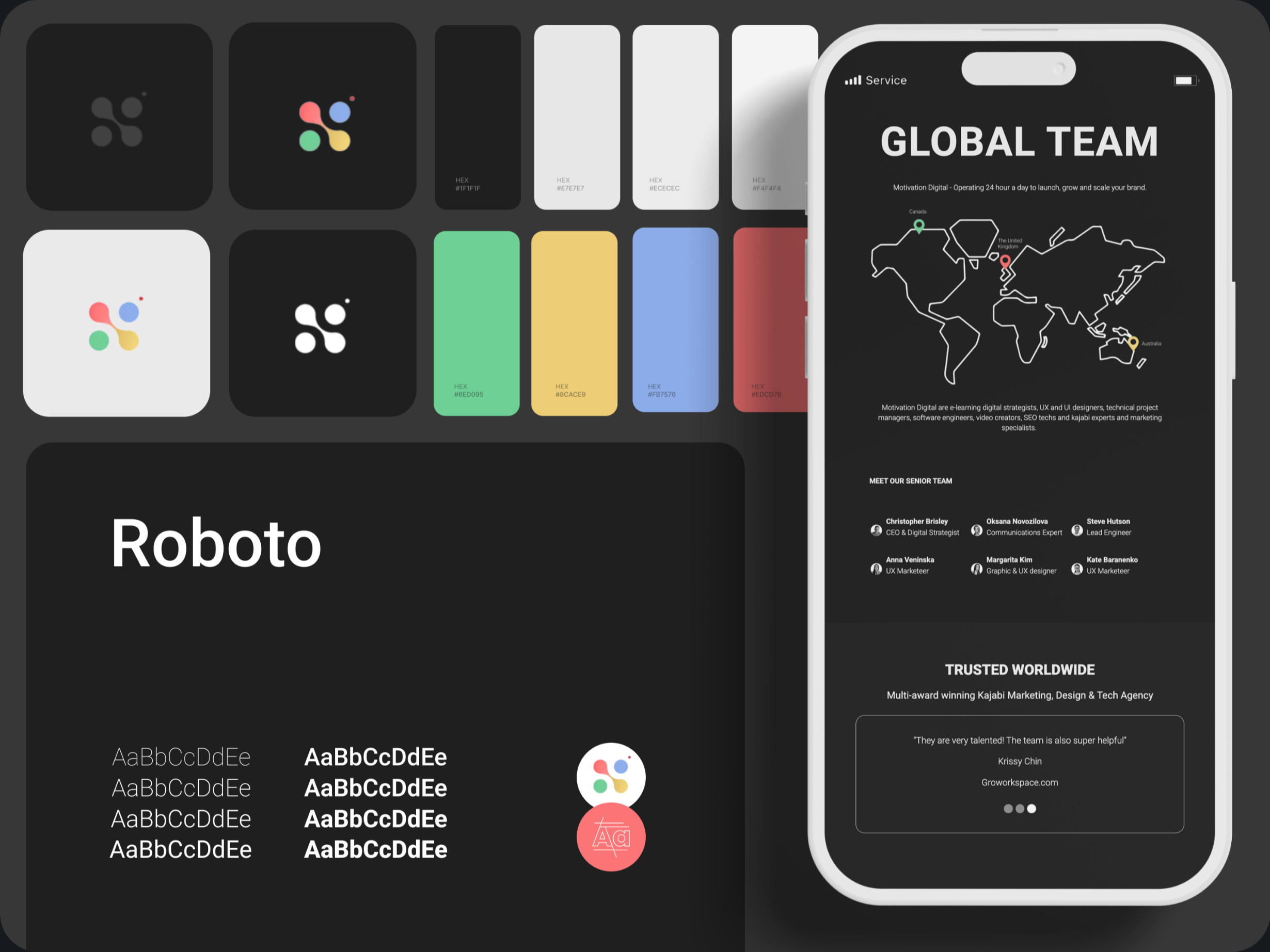
Primary Dark – #141414
The foundation. Confident, minimal, and the reason everything else pops.
Accent Green – #6FCF97
Fresh energy. Signals interaction or success without screaming at you.
Highlight Blue – #8CAECC
Calm and balanced. Adds professionalism and helps guide the eye.
Action Red – #FF6A6A
Impossible to ignore. Reserved for alerts, focus points, and moments that need attention.
Warm Gold – #F3D47B
Subtle warmth. A bit of personality and optimism when we need it.
Together, they create something that feels modern and alive against the dark backdrop. Functional, memorable, and unmistakably ours.
Typeface
One typeface: Roboto. That's it. It's clean, modern, and incredibly legible—especially on dark backgrounds. The geometric forms keep things sharp, while the balanced proportions make it approachable rather than cold.
-
Headings and statements: Roboto Bold or Medium for structure and confidence
-
Body and details: Roboto Regular for comfortable, clear reading
-
Hierarchy: Built through weight and spacing, not decoration
Using a single font system keeps everything consistent and lets the design speak without unnecessary noise.
The logo
Our logo follows the same philosophy: minimal form, meaningful detail. Clean type that's direct and balanced. No unnecessary flourishes.
There's a small red dot at the top right. It represents the moment of creation—like a record light turning on. It's also a nod to Studio, our built-in video call platform that lets clients host meetings directly on their site. That dot transforms the logo from static to active. A reminder that we're always creating, always live.
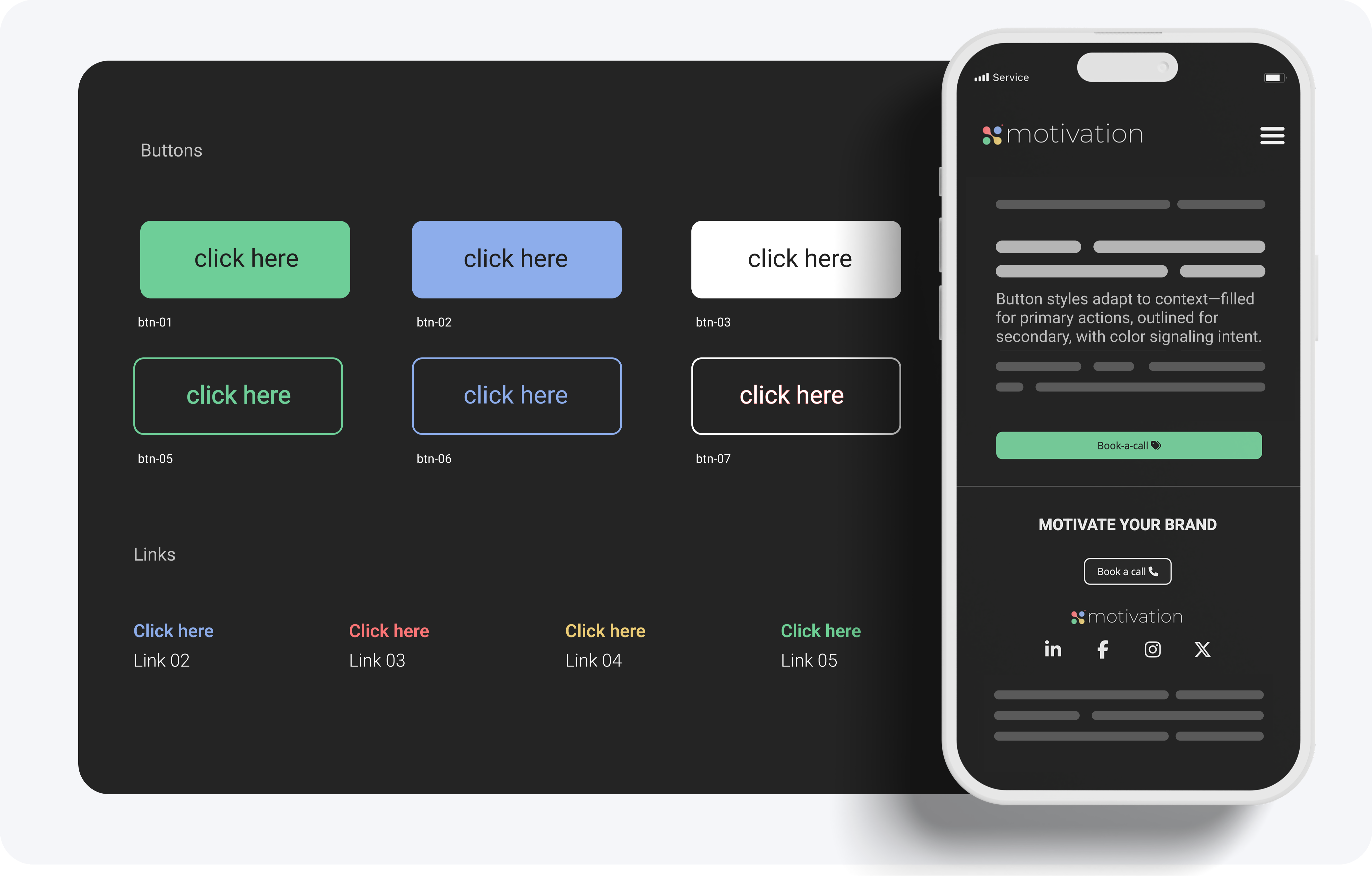
Buttons & links
Interaction design follows the same principle: clarity first.
Buttons are minimal with subtle animations that feel responsive without being distracting. Colors guide action—green for positive flow, red for high-emphasis moments, gold for premium touches.
Links stay clean by only showing underlines on hover. The result is a smooth, confident experience that feels intentional across every device.
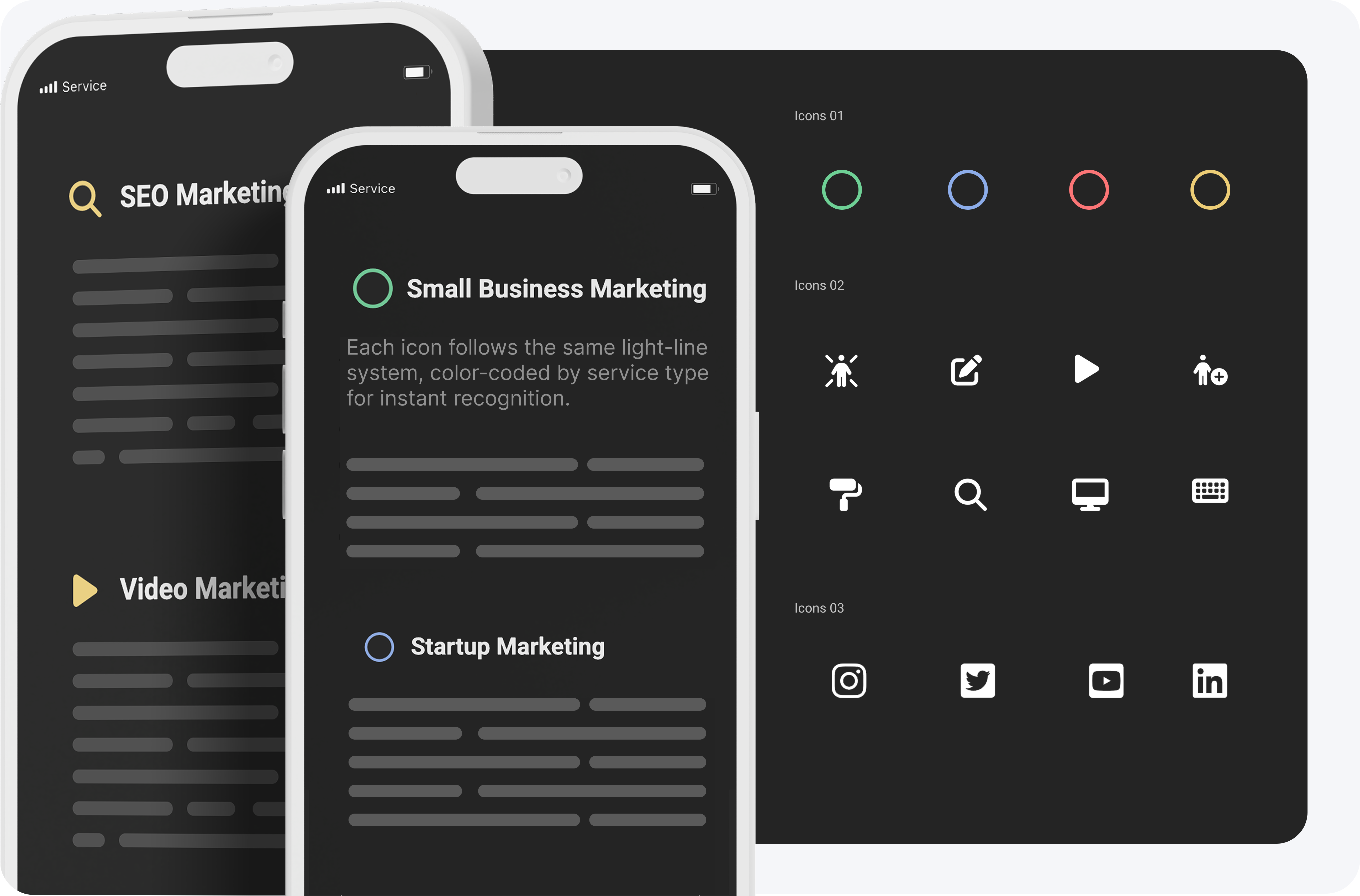
Icons
Light-line system. Geometric, simple, consistent weight.
Every icon was either chosen or refined to match Roboto's rhythm—rounded corners, even proportions, balanced spacing. This keeps the brand feeling cohesive from text to visuals, ensuring every detail aligns with the same tone.
Stylesheet & Design System
We built a comprehensive stylesheet that keeps everything consistent without thinking twice. Every card style, sidebar element, color application, and typographic choice flows from a single system that distributes across the entire platform.
This means when we update a button style or adjust spacing, it propagates everywhere automatically. No hunting through pages to fix inconsistencies. The system handles card variants, navigation patterns, color assignments, and component behaviors—all defined once, applied everywhere. It's how we maintain visual coherence at scale while keeping the codebase clean.
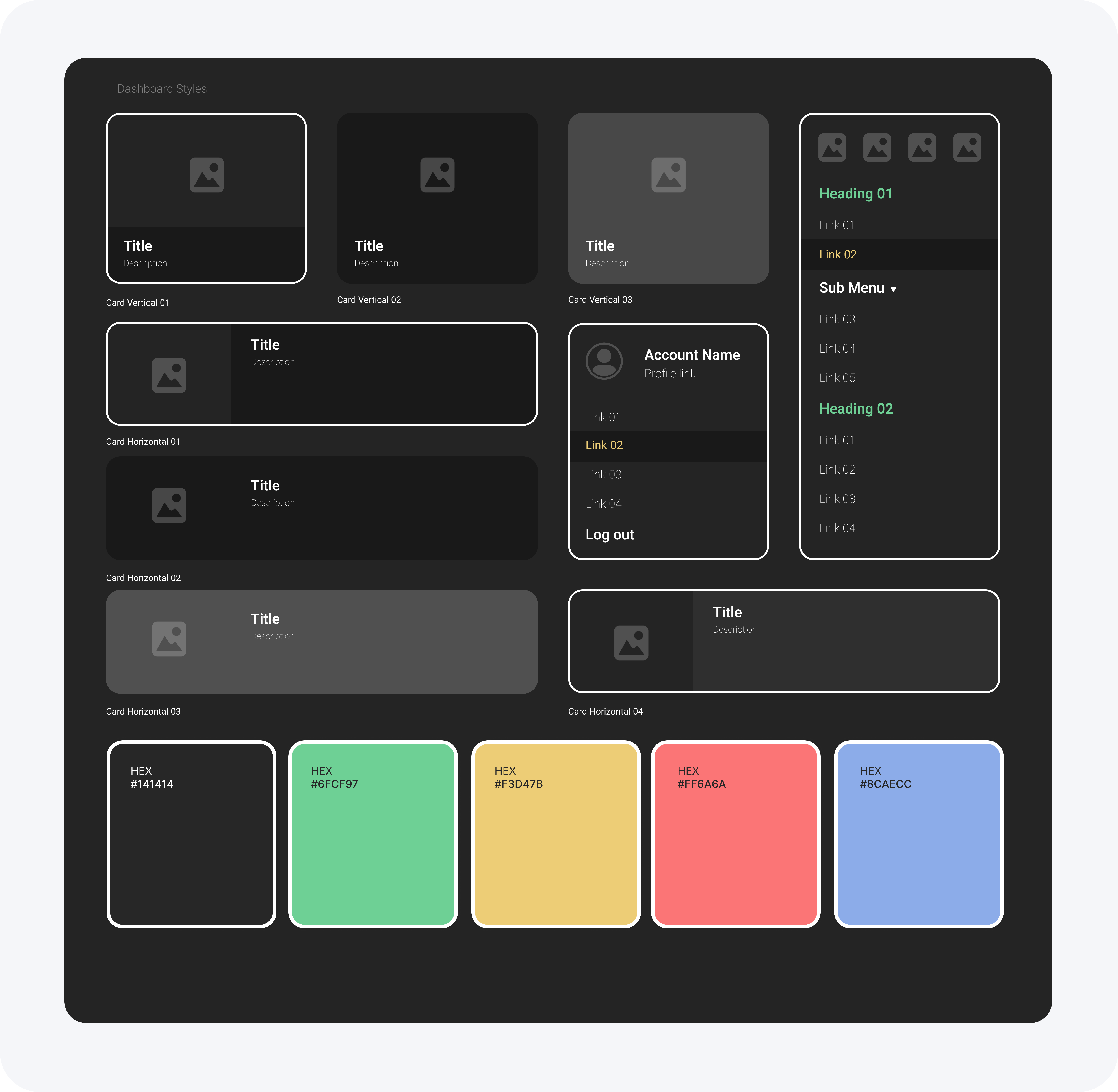
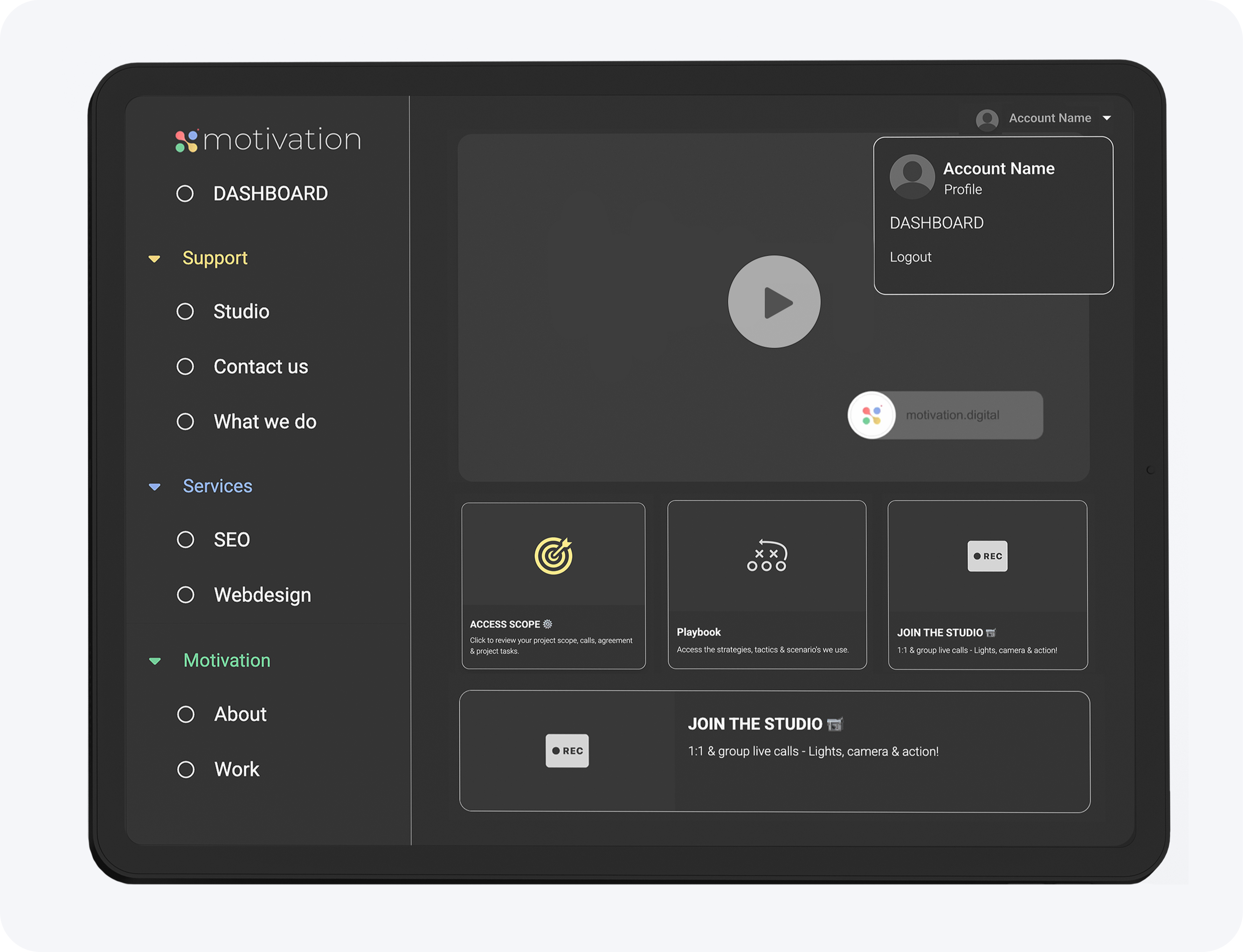
Dashboard Experience
The dashboard is where everything comes together. Personal, structured, and visually calm—designed for creators who need both function and clarity.
We built a card-based system that adapts to each user's workspace. Service cards, account menus, navigation modules—each component feels tactile but minimal, with sharp edges softened by subtle depth. The sidebar organizes services and actions into collapsible sections, making navigation intuitive without cluttering the view.
Every element surfaces essential information without overwhelming the user. The dark foundation keeps focus where it belongs, while accent colors guide attention to what matters. It's a workspace that feels premium but stays out of your way.
Bringing it all together
Everything points toward the same idea: design that's clear, consistent, and deliberate.
The dark foundation gives the system strength. The black-and-white imagery keeps attention where it belongs. The accent colors inject just enough energy to make it feel alive.
It's a brand built to be at its best in the dark.


